The holidays are a time for togetherness, family cheer and love, warmth, thankfulness…stress, panic, anxiety.. But hey – no good movie ever had a happy beginning, middle, and end. There had to be some turmoil at some point, right? I look at life much in the same way. With all of the bad that comes in our lives, the good is sure to follow. Plus, we will appreciate it that much more when it does happen.
So, on to my family time favorite – Thanksgiving.
There is something cleansing to me about the transition from Summer to Fall. The cool, crisp air after months of sweltering heat does something to calm my nerves and cause me to take a deep, refreshing breath of air. And I’ve found that I actually hold my family in the same regards. You know how they drive you a little crazy sometimes but every now and then you just need to take a nice deep breath of family in order to recharge? Thanksgivings are like that.
When we were younger, somehow our mother — alone — managed to cook for 7 children and a husband. Yes, 7. It is not a typo. One day if I’m somehow blessed with marriage and manage to pop out at least one baby from my pain intolerant body, I will marvel at the fact that my mother did this 7 times and somehow managed to take care of all of us without losing her mind. The good thing is, now all the hard work my mother put in pays off because we each bring a dish to whichever sibling is hosting that year. Isn’t that nice of us? While the food is the biggest deal (my mouth is watering just thinking about the mac and cheese – sorry no pictures, this is a design post), we also spend some time creating the “general ambiance”(we’re fancy).
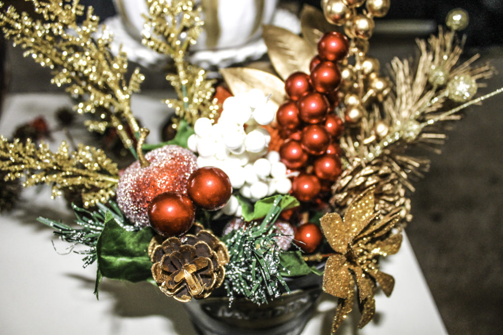
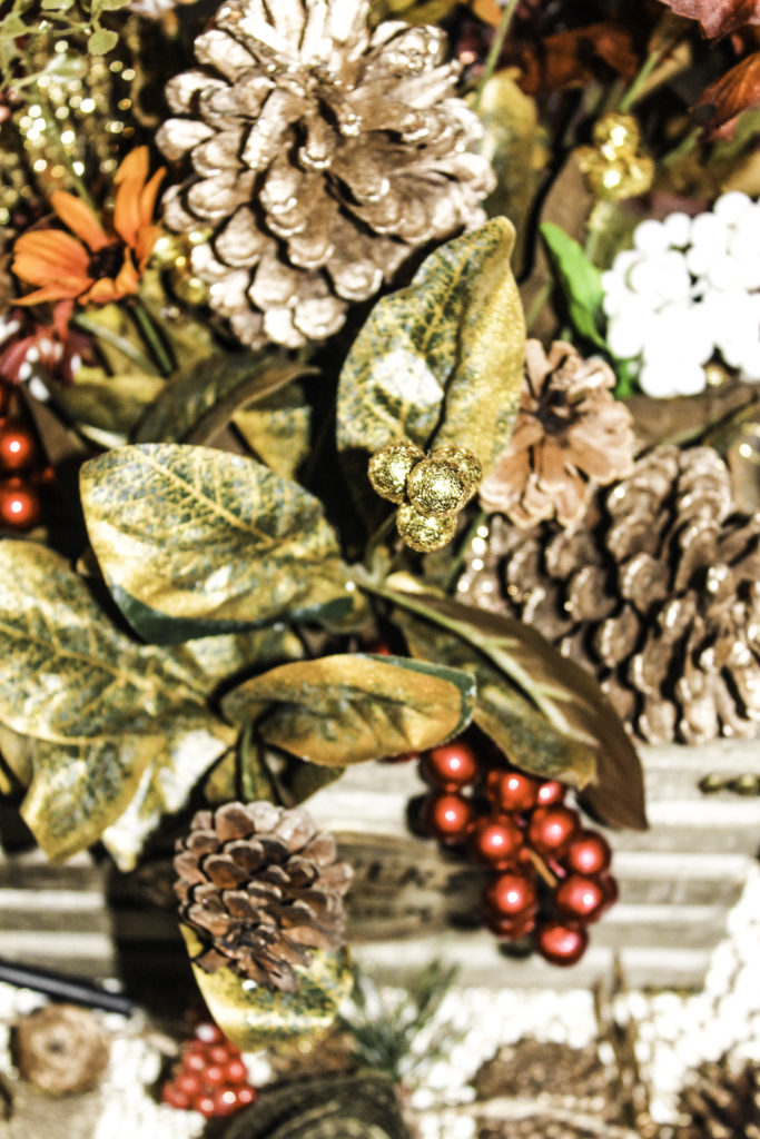
It’s no secret that Autumn is one of my favorite seasons. Not just because of the sweater weather, but because of the colors. The changing colors of the trees are something I can’t get enough of year after year and always wish they would stay longer. This is the inspiration I used in creating these arrangements. While it’s true that everything that glitters is not gold, it’s also true that everything that glitters is so pretty.
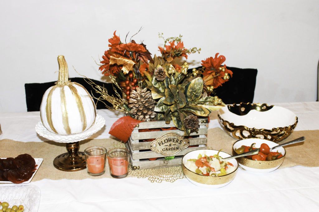
However, with “glittery” objects, it’s really easy to push the borders of chiq and land on cheesy. The best way to offset this is to use sparingly. Just like with fine diamonds, an engagement ring, bracelet or necklace, it’s eye catching and beautiful when it hits the light. But too much of it and you’re a walking eye sore, blinding people with your tackiness. The best way to offset the “wet” look of glitter is to pair it with something “dry”. In this case, it would be the solid colors of the pine cones and rich, green of the leaves.
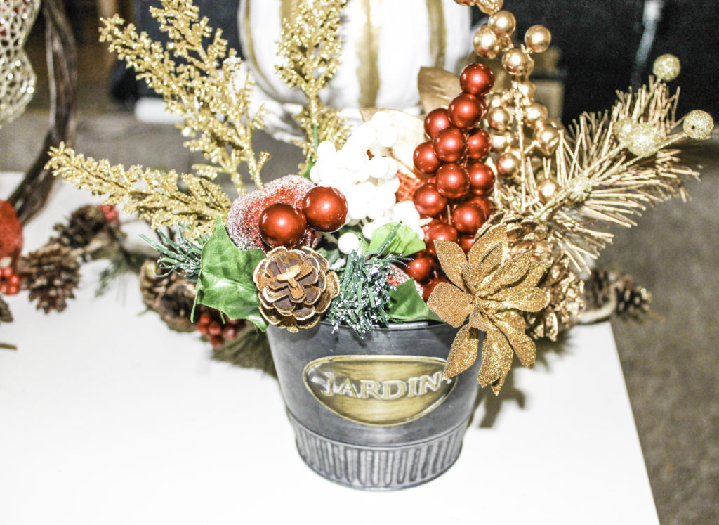
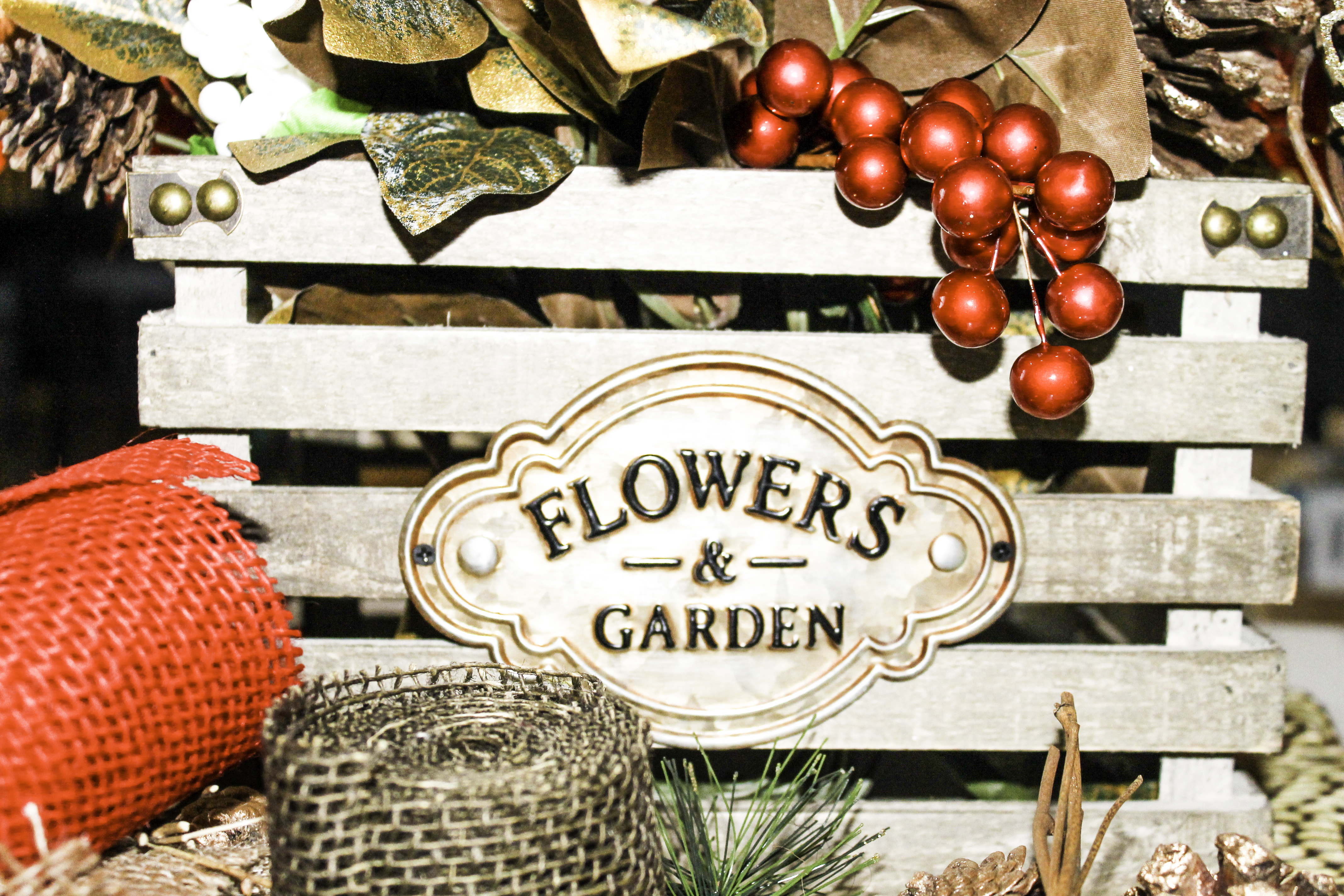
Alternatively, I used a planter as a non-traditional vase, to incorporate a rustic, homey touch. Red is such a powerful color. In all of it’s heavily saturated goodness, use it sparingly as you would the glitter. It often times makes a statement and causes the eye to connect directly to it. My goal here was to offset the holly from the center and add another touch just to the left of center. Symmetry is important in the way that you make things asymmetrical if that makes sense.
Combining all of these warm tones and juxtaposing them with a creamy white directly in the center gives balance while still maintaining a warm color palette.
The actual centerpiece for the dinner table carries much of the same hues. Sticking with my love of non traditional vases, I used this miniature wooden crate to house the additional fall flowers that make up this arrangement.
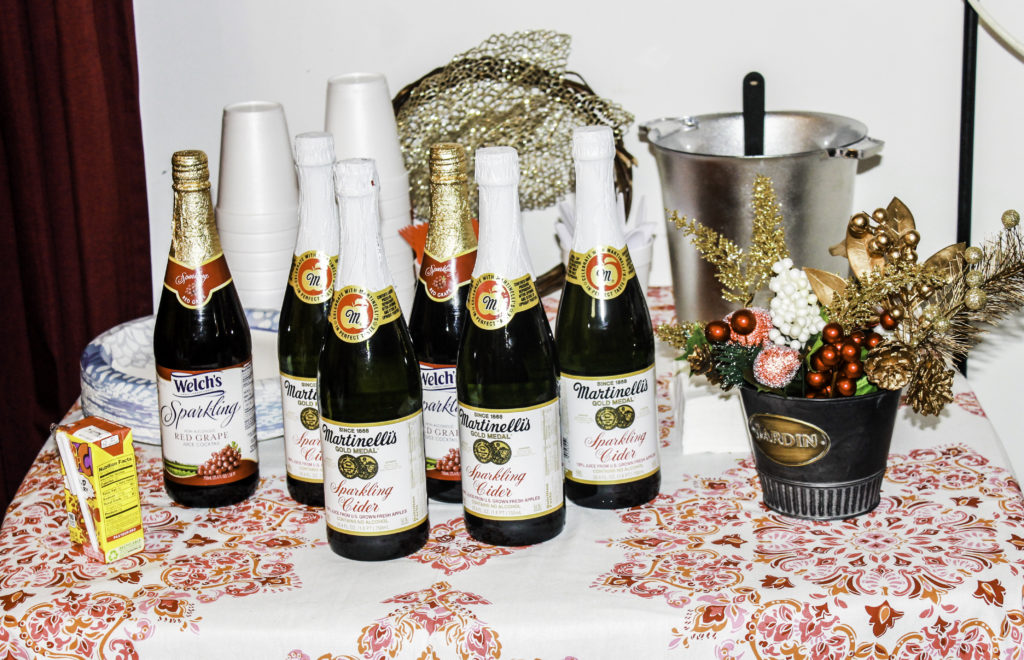
Food and drinks are a great way to compliment and add to your decorations as well. Just as you would with a dessert table for a party, you can apply the same idea to table decor. When throwing a dinner party, using small appetizers and condiments to compliment the decor is a great way to create visual interest. Serving dishes can have a large impact as well. White and gold are a timeless trend and seen very frequently throughout multiple color palettes. There’s a reason for that. It compliments nearly any design concept. When you’re in a bind or short on inspiration, it will almost surely work for your decor project. Below I used a clean white tablecloth and a natural toned linen runner to stick with the rustic theme of this set up and minimize the use of color so as not to detract from the centerpiece. As I’ve said before and as you can see below, red is powerful.
One of my other fave DIY projects for the fall is pumpkin picking. There’s a local farm that takes you on a hay ride to different fields, eventually ending up at the pumpkin patch. You can collect anything from a variety of apples to peaches, squash, cabbage, sweet potatoes, yams.. yum. All of which end up on our Thanksgiving table. There’s nothing like fresh fruit and veggies that you picked yourself. It almost makes you wish you could wake up before the sun rises every morning to put in long hours of manual labor.
Almost.
But I do respect the farmers for what they do. Especially considering the fact that I can’t seem to pull myself out of the bed during normal daylight hours for a one hour session at the gym. But hey- no one’s judging anyone here.
So, yeah – painting pumpkins. On any given Friday night in the fall, you can find me sitting down at my coffee table in my living room with an assortment of paints, paintbrushes, little embellishments, a good movie and in absolute contentment. I absolutely love little projects like these and am always shopping for ideas on Pinterest of DIY projects for the home. Moving from my last apartment to this one, the whole thing was just about designed and crafted before I was handed the keys.
I can’t help it – I’m a planner.
As human beings, it seems like we’re always trying to connect with nature in some way, shape or form. Whether it’s visiting the beach or the park, hiking or some other type of Summer fun. Sometimes we even have the urge to bring the outside in with houseplants and vases of floral arrangements to set here and there.
They say the best color palettes are found in nature. I find that to be undoubtedly true. Anytime you’re lacking inspiration or need some ideas, just simply take a walk. Not only does it clear your head, it’ll do all of the hard work in color selection for you. If you live under a rock or perhaps in a sewer (hey there ninja turtle), another option is Adobe Capture. This is an amazing tool for formulating color palettes and you can download it directly to your phone via the app store. It will allow you to point your camera at an object and then lists suggestions for complimenting palettes. All of your color-challenged problems – solved.
Love ♥ Always,
Suhaila XO